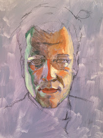
Twice a month I teach a painting class for some friends in Columbia. The students in my class were interested in painting people and asked if we could spend a few weeks working on portraits. I am posting some updated process photos as a reference for my class. And maybe other painters out there will find this helpful if they stumble upon my blog.
1. The Palette
There are lots of different ways to mix a palette for portrait painting. This is one that I have like and chose as a starting point for our class.
Our starting colors are...
Cadmium Red Medium
Alizarin Crimson
Yellow Ochre
Viridian Green
Cerulean Blue
White
The first color to mix is the base flesh tone.
Cadmium Red + Yellow Ochre = Base
Then make a cooler and a warmer (pinker) version of the base.
Base + Viridian = Cool
Base + Alizarin = Warm
The next step is to add increasing amounts of white to create several stages of lightened color.
Cool--> Light cool---> Lighter---> Lighter
Base--> Light Base---> Lighter---> Lighter
Warm--> Light Warm---> Lighter---> Lighter
Next, I made a warm brown. I lighten this color with stages of yellow ochre.
Cad Red + Alizarin + Viridian = Warm Brown
Warm Brown---> Yellower---> Yellower---> Yellower
Then I take the same warm brown
and lighten it with Cerulean Blue, White and maybe some more Viridian Green.
Warm brown---> Cooler---> Cooler---> Cooler
I also made a little purple.
Alizarin + Cerulean = Purple
Note: This palette is just a suggested starting point. Other colors will need to be added depending on the lighting, complexion, hair color, etc. I went ahead and added raw umber and naples yellow to my palette as I looked over my reference photo.
2. Painting Shapes
Before any painting, I began with a charcoal drawing. Maybe I will post another set of instructions on drawing the face soon. The drawing was done on a toned background. Never start painting on a white canvas. Many artists start their painting by adding in all of the dark values and slowly working the piece lighter and lighter. I agree that artists should save highlights until the end, but I suggest adding some darks and some lights. These values on a mid-tone background will give you a better sense of the overall value of your work and help you compare the lights and darks as you go.
As I start painting I am looking for large shapes of color/value. Do not worry about blending the areas between shapes. The two major issues I see with beginner painters is 1) a fear of lights and darks and 2) and a strong urge to blend everything together from the start.
On a scale from 1-10 your painting should include some values on the entire spectrum. I see lots of beginners who have a hard time going lighter than 3-4 or darker than 6-7. Everything stays really dull, right around the middle.
If the transition from one shape to the next is too harsh and you must blend some, do so by making new colors and outlining the shapes. Unlike drawing, where an artist makes a darker value by pressing harder and harder into the paper, painting changes color by what you mix on your palette, NOT how the paint is applied. On the lighter side of my forehead I wanted to show some of the transition from the base color to the light. So I mixed several color gradients between the two shapes from dark to light. Then I continued to outline the dark shape lighter and lighter.
None of the colors I mixed are too outrageous. But, some of the colors I have are more vibrant than what I see in my reference photo. That is okay. I tell my class to look for opportunities to use your color. There will be some blues,pinks, greens, and purples. If necessary you can mute these colors later on, but it's good to go ahead and include them early on.
I continued to paint the large shapes until the entire face is covered. I also, began dividing some of the larger shapes into smaller shapes with minor value/hue shifts.
3. Transitions
After my entire face had some color I really started to focus on the transitions. Again, I am simply outline existing shapes with stages of color between the two shapes. Flatter parts, like my forehead, will have larger areas for color change. Whereas, sharp areas like the bridge of my nose, may have several values squeezed into thin lines over a small area.
I spot checked my colors with my reference and began to tweak the colors here and there. Several places on my face were more purple than green. I used and thin wash in some places, and in other I had to completely repaint an area with the color adjustment. But a hint of even my brightest colors still shines through.
Check back for an update with the final piece!!!!


This was very helpful, may I ask how you managed to keep your linework from getting entirely covered up in the beginning stages? Did you make an effort not to paint over those lines too soon or were the lines just dark enough to show through the paint? Thanks! -random artist
ReplyDelete